


Good in Every Light
Living With Farrow & Ball

For many years my mom would bring a Farrow & Ball color book with us on trips to Europe. She’s an interior designer and wanted to match, as closely as possible, whatever charismatic shade of rose or pale yellow she came across. She rightly didn’t trust a photo; she needed to match the card. This seemed fairly eccentric at the time. Now it feels like downright genius. You have to be precise to get these things right.
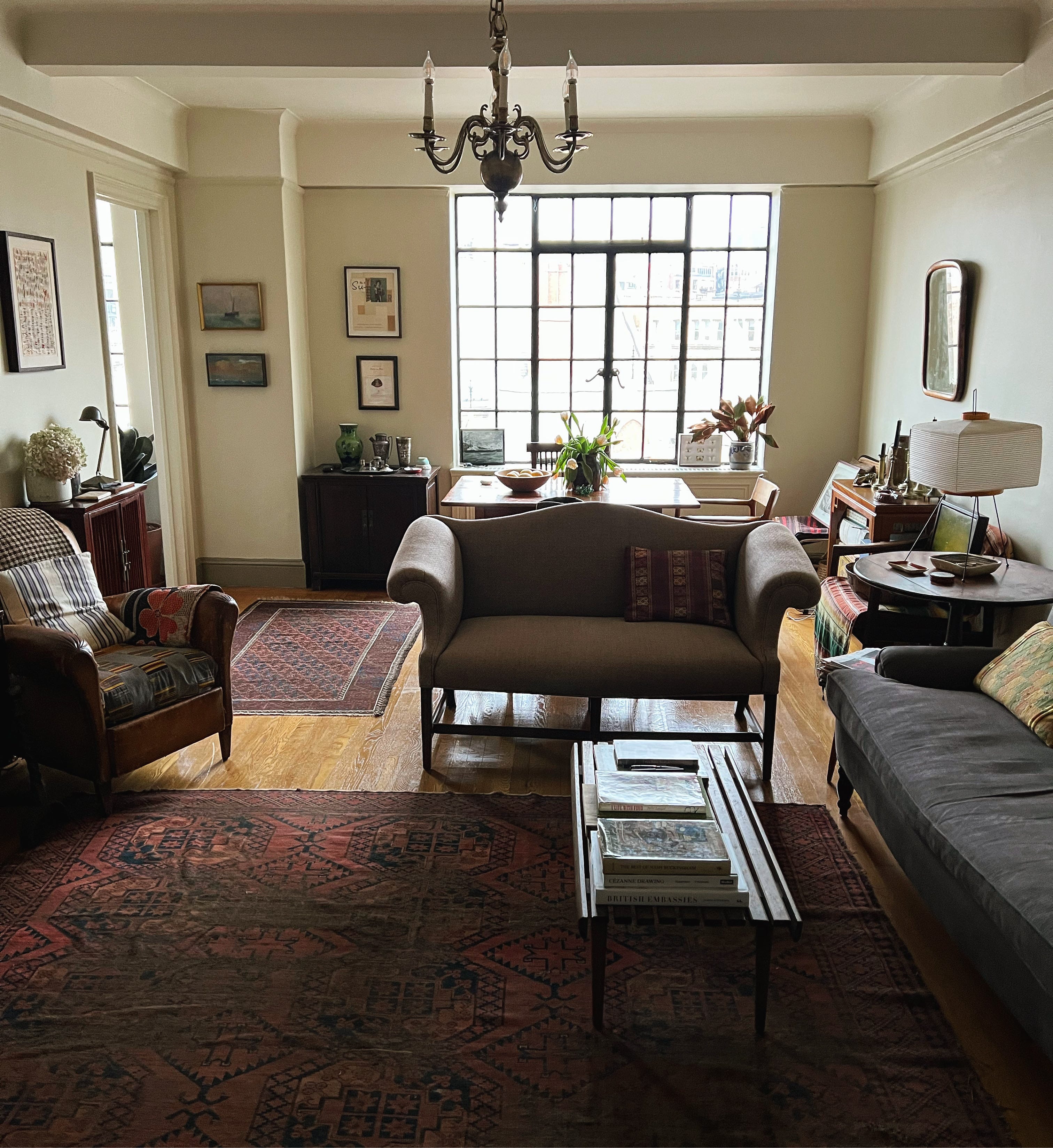
I appreciated her love of color, but it didn’t apply to me directly. I’ve lived in five apartments in New York and love them all in different ways (the one on the Upper West Side I love a little less). I’ve always been particular about where I live (that's probably an understatement) and each has had a unique character. But until Emilie and I moved into our current apartment, the walls of every one have been white.
White white. Boring white. Whatever came in the apartment white. It didn’t always matter. The walls were covered in art, there were plenty of windows (when I was lucky), and it didn’t deter the situation. Well this apartment, my sixth, was going to be different. We wanted something softer and less stark. There were lots of walls, uninterrupted by windows (a blessing and a curse) and we wanted a new color. Ultimately, we returned to Farrow & Ball to sort us out. We spoke with their color consultant to come up with a scheme that made sense for us. It was one of the great design experiences I’ve had.